Summary
Only 12,8% of the people mentioned on secondary school books are women, this data reflects a challenge that teachers and students deal with when trying to find female role-models. Desglosadas (Broken down women) is a project that aims to show the reality and push the norm of written history, including the female side and fighting the systematic censorship that they had to deal with, specially the artists. To achieve this, graphic design is used as a tool for divulgation in a cultural project, launching a traveling exhibition which first destination is the streets of Jaén. With the title "Desglosadas: Spanish women buried by the 20th century", it aims to reveal to unspecialized passbyers the hidden truth about part of Spain's recent history, the female side. Dusting the works of female creatives of that time that help portray the events that happened and contributing to giving them back their rightful place.
- Keep in mind that this project took four months and is a Final Degree Project for my graphic desing major so this process is longer than others.
Investigation
There are already many existing projects that aim to raise awareness on remarkable females of different areas, like referentas, diseñadorasgraficas., mujeres bacanas, shethoughtit. What makes this project different is the way it showcases women. It finds a way to talk about them within their historical context, showcasing their work in different areas as an example of the situations they experienced during their life and helping the public further understand and locate them within the whole context. This works as an example of how women's history would have been told if they were the opposite gender, raising awareness on the lack of female representation in the history we get taught.
The investigation process was long and difficult because history is written from a male point of view and only mentions women when the presence of a unique individual influenced society, like the queen Isabel II of Spain. This information was managed to be found thanks to the presence of digital papers and journals that include women's history in little parts found thanks to the investigation of many female researchers. Asking individuals that have already looked into this matter for their own projects, and contacting professional female history researchers to help was crucial. Adding Antonia Valencia's words:
" Negative and positive rolemodels for women, their relationship with education, work, power, love, sexuality, fear... even the absensce of women on these facts is already something to take from" Valencia, A. F. translated from spanish.
During this process, all the women found were included and classified in an archive created in Notion that I personally keep growing. Sadly, a fuller picture was not possible due to the time limitations that defined the investigation of the project in one month.


Creative process
Branding
The brand surrounding the project embraces the concept of censorship from the naming, which initially was meant to be Jerisglosas, a very straight transcription of the greek χωρίς meaning without and γλώσσα tongue. But ended up being called Desglosadas (broken down women) which is bold, with a clear meaning, appealing, makes the public notice what this is about and references the censorship through the negative prefix des- and glosadas (refering back to the greek term for tongue).
The logo mark is created in a traditional modern spanish Cruz novillo style, looking for geometry, simmetry and simplicity which is timeless but also refers to the past. Lots of sketches were made playing around the brainstorming ideas ( censorship, tongueless, silence...), testing colors and finally shaping it with the geometry used in the logotype font. Further use guides are written down in a brand book. (Videito)The brand is aproached in a formal but warm tone that treats the message with upmost respect and shows the target how close it hits to home.
Exhibition
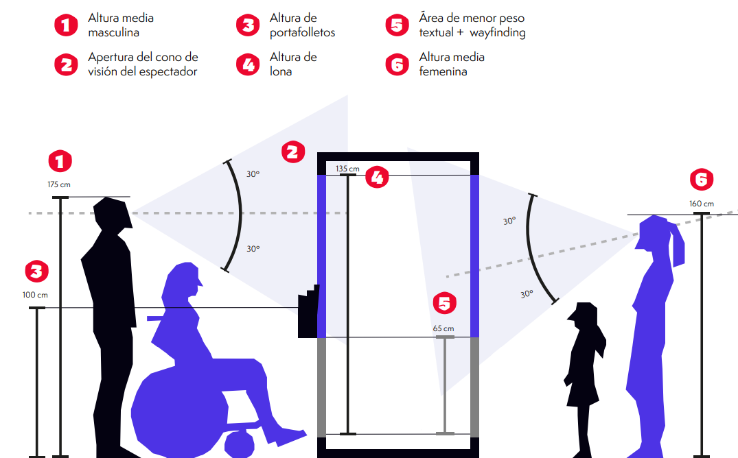
The exhibition aims to bring the investigation to the target in a more attractive way, different from the usual digital media. The most fitting idea was making it a traveling exterior exhibition, which would reach the highest number of people. Having in mind sustainability and budget, the main support are canvases that get tied onto metallic beams which get easily assembled at each location and that shape cubes arranged in a specific way for guiding the visitors. Ergonomic and accesibility matters are taken in mind during the design process of every piece, shaping the layout for the information, which is further expanded by a panflet that explains what is the objective of this project, leads to the web and provides free merchandising upon visit of the location.The information is shown cronologically, which would normally imply a circular or linear pathing, but in this case, it's taken in mind that people might approach the exhibition in any point of it, so every piece is made to be part of a whole but understood by itself, allowing the target to be intrigued and check it fully.
The text is formatted and paired with images from that time period, including the previously mentioned works of the women from that context, and graphic pieces that aim to help explain part of the investigation.
Advertising campaign
For the campaign, the objective was attracting as many people as possible, usually with different interests and context, for then making them reconsider the presented matter and the current situation. For these reasons, the graphics allude to the curiosity of the passbyers, that facing something different, might want to find out what it is about. The supports used are:
- Street posters
- Mupi street poster
- Two full page ads in the local newspaper (of the town hosting the exhibit)
- Medium rectangle digital ad on a different local newspaper
- Below the line innitiative that makes the visitors interact with the free merch (stickers), keeping some and freely using the rest of them around the proximities, raising curiosity about the project and helping further spread it's reach
- Instagram profile that further expands information of the project and gives context on other women not mentioned during the exhibition
Web design
As a final step, this project is turned into a web that has a landing page, an archive of women found during the investigation, a digital version of the exhibition for those who cant attend it physically, and an about us tag that shows some insights behind the creation of the project.


Project showcase


.jpg)
.jpg)
.jpg)

.jpg)
.jpg)