
Summary
Data from the F.A.O. states that 17% of food production is wasted by the consumers, which translates in the loss of meals capable of feeding 1.260 millions of people each year. This waste equals about 8 to 10% of the greenhouse gases production, contributing negatively to various facets. Diminishing these numbers is crucial to transition into a sustainable processed food system that makes the most out of resources and reduces our impact in the planet. To help families deal with these factors, we have developped this app.
Eleusi helps homes manage food, planning and suggesting meals depending on the expiration date of available products. This makes sure that those opened containers deep inside the fridge don't go to waste, helping save some money on something as basic as food.
Investigation
First thing was defining the problem and for doing so, there needed to be market insight on the matter. The app store is searched for apps with a similar concept that already have a place in the market, finding names like the following. Cuisine: Inventory and Recipes, Gloop: grocery shop list maker and Best Before. Out of all the apps found, only Best before includes the expiry dates and its a pretty outdated and non attractive system very far from the original idea for this project. Every app is downloaded, reviewed, checked for multiple utilities, seeing what is useful and attractive and other factors that could be considered problems to have them in mind. That investigation + the various reviews that users left for each app, drew the path and objectives to be followed.
Objectives
- Create an attractive and recognizable brand
- Help users manage their food resources in an efficient way
- Using a customizable notification system
- Create a highly adjustable app where the user can edit things the way they need them
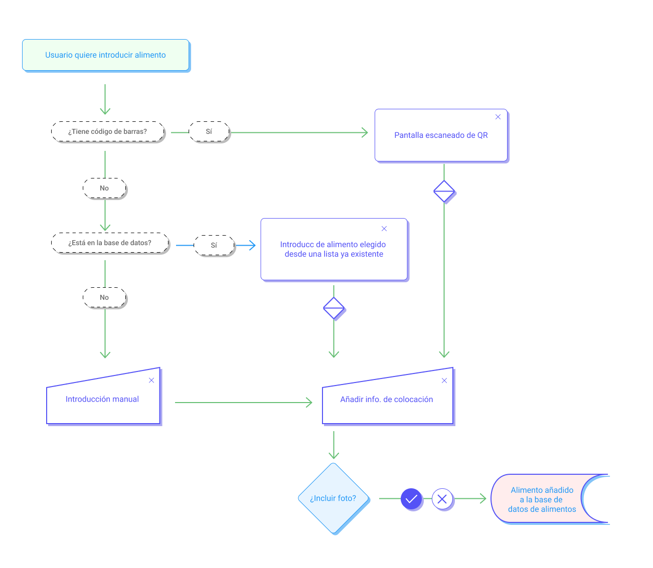
After this, the app is broken down in different sections to determine the info structure to be followed, using primarily a hub & spoke structure surrounding the whole app, and a nested doll scheme for the product listings. These structures organize the app in 5 main tabs that help the users find what they want in a quick and easy way, adding shortcuts that help them make tasks with the least steps possible (you can see this further in the sitemap and flowcharts below). The app is then sketched through a series of wireframes that helped flesh the app.
A really important part to mention is the customization and accesibility options available. One of the crucial aspects that users mentioned as a problem was the excessive amount of notifications. Eleusi provides the user with the entire choice of what they want to be notified outside the app and how often, as well as the adjustment of colors for soon to be expired products to help color blind users.
Creative process
The brand is surrounded by a green message, related to sustainability and care; values that can be seen in the corporative colors, the main ones being called "green" and "earth" and the secondarys "cream" and "biscuit". Eleusi's naming comes from the greek λύσις /lusis/ meaning solution. Due to de app being born and developped in Spain, the name was adapted a little bit to help the users remember it, writting the pronunciation of the first letter "L" /ele/ and using it as a short version of the whole naming in the logomark. The only addition that the logomark has is a half-sphere below it, which represents a plate that carries the letters comparing them to the food served on a plate. This mark was designed to resemble a friendly face when used as an app icon on the phone, helping further distinguish it from competitors.
The font used in the logo is Salks, a playful bold font created by Alluyeah Studio that embodies closeness and warmth. The same stroke thickness and style was used in the icons created for the app, the rest of brand appliances use Roboto, the android default font, with the purpose of feeling familiar to the user. All the components for the app use a simple design that aims for clarity and mostly follow the guidelines of Android's Material Design. As a result, the app has a clear and legible structure that makes the user capable of managing tasks in easy and quick ways; and giving them the choice of customizing items to benefit their recognition process (with options like being able to choose icons or custom images for products).


