Summary
Milkbash emerges from the need to transform a personal online presence into a structured, scalable platform for 3D artists. What began as a collection of scattered resources evolved into a product-oriented website designed to organize knowledge, tools, and downloadable assets in a way that feels accessible and intuitive. The main challenge was balancing a growing amount of content with a navigation system that encourages exploration without overwhelming the user.
To address this, the project focused on defining a clear information architecture supported by early wireframes and structural sketches, followed by mid-fidelity prototypes used for observational usability testing with external users. These iterations helped refine content hierarchy, filtering logic, and page flow. Built within no-code and CMS constraints, the final solution prioritizes clarity, scalability, and client autonomy.
Investigation
The project started with a clear idea given by the client, they wanted a single platform where 3D artists could find learning resources and downloadable assets without the experience feeling fragmented or complex. The main challenge was balancing content, downloads, and future scalability while keeping everything easy to manage for the client.
To understand the context, existing platforms focused on 3D assets and learning resources were explored. Many of them rely on multiple tools, external shops, or poorly organized libraries that make navigation harder than necessary. In several cases, the webs themselves felt outdated, far from visually pleasing, content felt scattered, filters were limited and made the experience bumpy for the user.
This initial exploration helped define the direction of the project: a clean, well-structured website that could be expanded over time, with clear separation between educational content and downloadable resources, while still feeling like a single cohesive product.
Objectives
- Create a clear and approachable platform for 3D artists to browse and learn
- Organize educational content and downloadable assets in a structured, intuitive way
- Build a system that can scale without redesigning the website from scratch
- Allow the client to update and manage content easily without technical knowledge
- Keep the experience visually strong but focused on usability
To achieve this, the website was broken down into clear sections and the information structure was explored through early flowcharts and wireframes. This helped define the navigation logic and content hierarchy before moving into visual design.
Mid-fi versions of the website were then used for observational usability testing with external users. These sessions helped validate navigation choices, filtering logic, and interaction clarity, allowing small but important adjustments before final implementation.
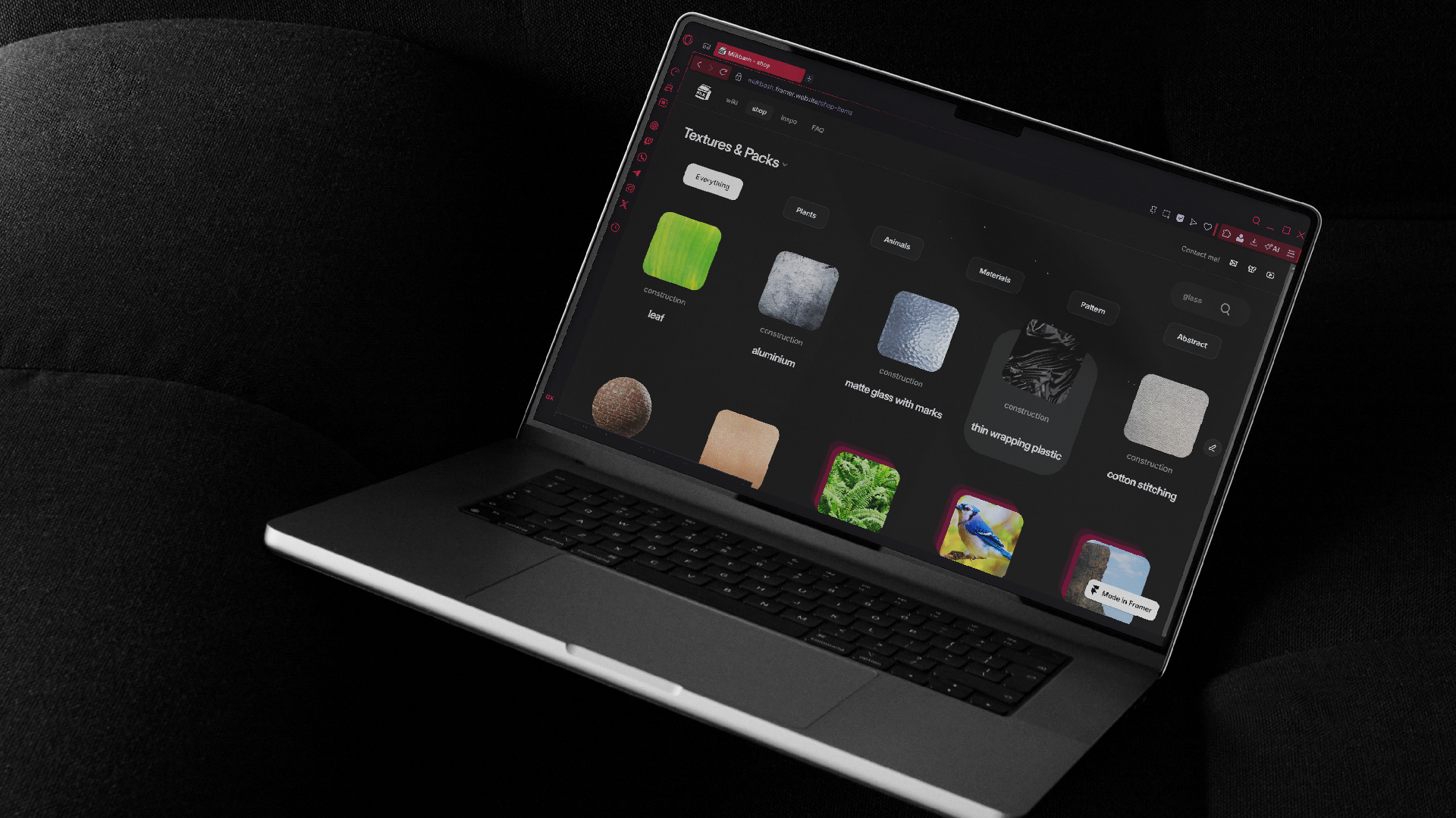
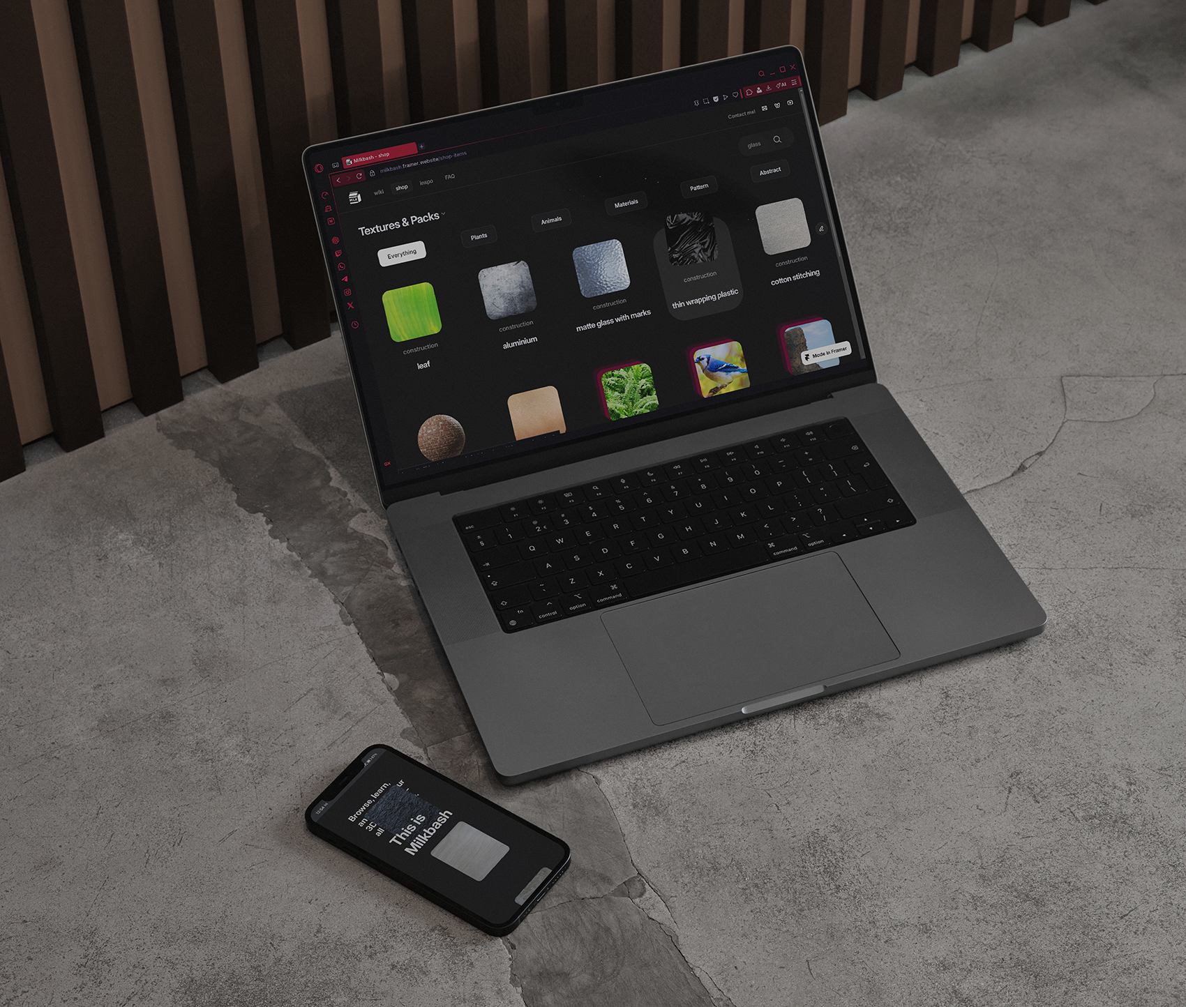
The shop content was connected to an external Airtable database to avoid CMS limitations and keep the system flexible, while Framer was used to design and control the visual experience. Filtering and navigation were designed to be simple and direct, helping users find specific textures or reference packs quickly without unnecessary steps.
.png)
.png)
Creative process
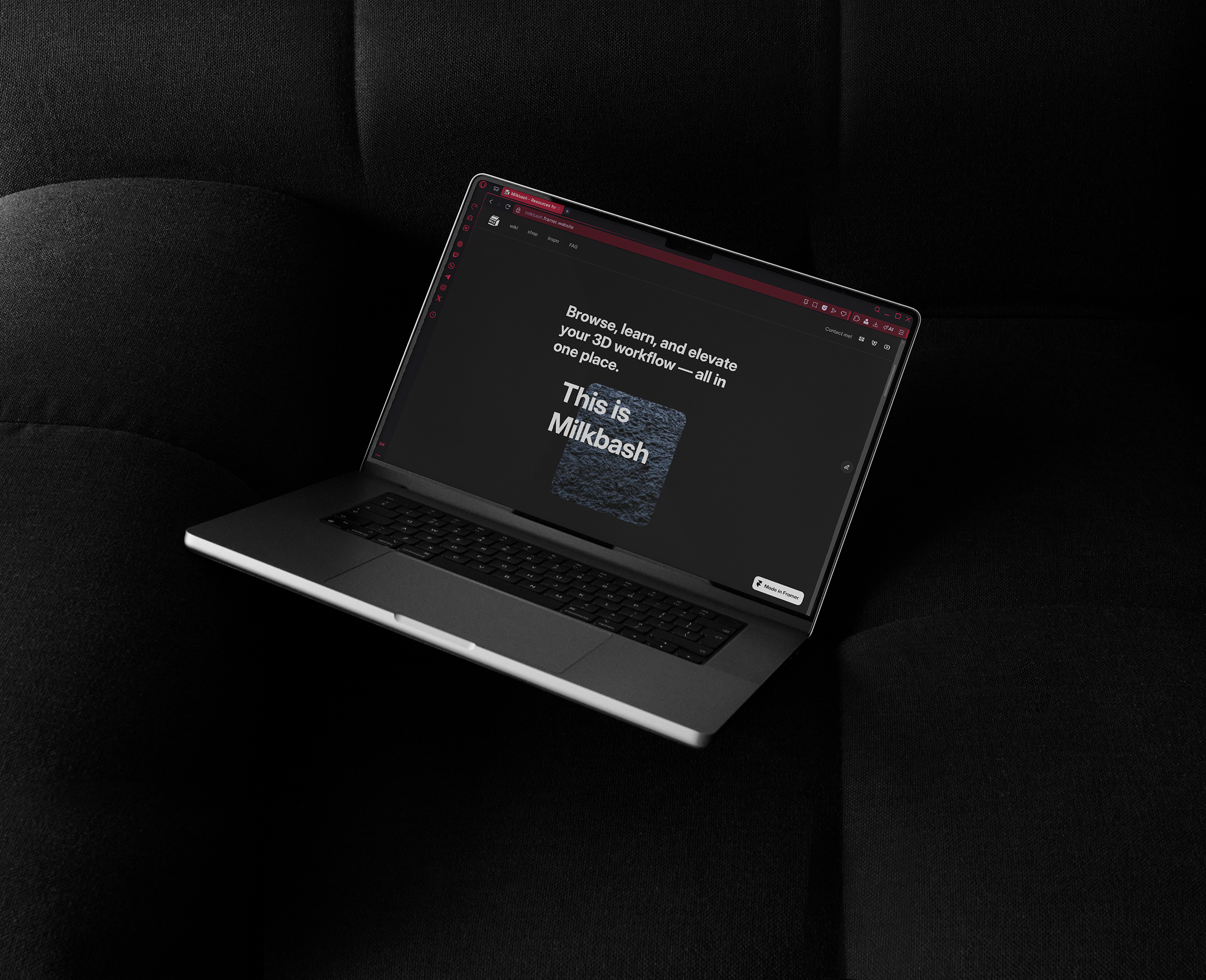
Alongside the UX work, a branding process was carried out. The client already had an online presence built around the name Milkbash, which they wanted to keep for recognizability. At the same time, the goal was to separate the website from their own persona and turn it into a product on its own.
Once the visual direction and tone of the website were defined, the branding was developed to match it. This included the logo, favicon, and supporting assets. The final mark is a simple milk cardboard box, designed to represent a product that is easy to acquire and consume — mirroring the way users interact with the platform and its resources.
Visually, the website uses a dark, modern interface inspired by the already existing tools commonly used in the 3D industry. Typography, spacing, and layout were kept clean and consistent to support readability and content hierarchy. The design relies on modular components, making the system easier to maintain and expand as new content is added.
From a UX perspective, the site prioritizes clarity over being filled with elements. Interactions such as filters and navigation elements were designed to feel lightweight and responsive, helping users move through the platform in a satisfying way.
A key part of the process was working within real technical constraints, such as using free plans and external tools. Instead of fighting these limits, the structure was designed around them, combining Framer for layout and interactions with Airtable for content management. The result is a flexible, scalable system that the client can maintain independently over time with no extra costs.


Project showcase
.png)