Summary
Viaraví is an olive oil brand localized in the province of Jaén, it comes to be with the mission of honoring the family tradition of olive trees, looking to share this product with the neighbours of the Sierra Morena county, representing the quality, the warmth and the care behind this local product.These olive trees located between Jabalquinto and Linares produce picual oil in two varieties, Gran Selección and Cosecha Temprana, making their respectives labeling and packaging. This design aims for pushing a launch campaign which captivates the target through the message of celebrating your roots.
Investigation
Upon an analysis of the brand and it's history, some ideas are brought into sketches for the labeling and packaging. The main purpose of this redesigs is bringing the product closer to the target and making it a faithful representation of it's values and the market place it occupys. As a reference, other olive oil brands with similar target, like: La carrera, Los omeya or Olea Jacta Est are studied.


Creative process
Labeling and packaging
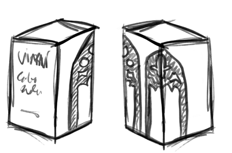
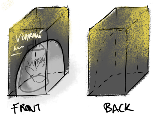
The labeling was quite straight forward once the ideas were set, and were further replicated on the packaging. For the Gran Selección variety, which is the normal product, the design shows the correlation between the two localities united by this brand, Jabalquino and Linares, taking an important symbol from a building in each of them. This element represented in the packaging, gives the opportunity to play with the positioning of the boxes, creating patterns and showcasing the brand in a fun way not only in the sell points but also in restaurants that purchase this brand. This element is repeated in the packaging and the labeling inside, playing with the empty frames through which you can see the inside of the bottle. As for the Cosecha Temprana, this is a gourmet product of higher quality and price. In this case, the bottle aims to show equally the warmth, the true work behind this product, and the quality it posesses. Reaching a label that depicts how the bottle is passed on from the worker to the client, printing their hand onto the bottle with a golden mark, and further representing the five generations that have been passing the family fields. The box outside aims to showcase the bottle and protect it, letting it be seen through. Additionally, a pack is designed for a special christmas campaign, offering two Cosecha Temprana bottles in a box with a handle. This box shows the message "The best olive oil is the one you share" on the side. The other side opens up to show the two bottles and a cutting board in the middle, adding more value to it, considering that after buying it as a gift, it can have a second life in any house.
Something worthy of mention is that he bottles and their packagings were made as prototypes and not final representations. Cosecha Temprana would be printed with serigraphy onto the bottle, but for this prototype was made with a full sticker using black as a background. Same goes for the box which would have the golden hand imprinted with reflective tint.
Campaign
Viaraví needed to get out in the market and reach their target in the province with a showcase of a traditional quality product that aligns with their personal values: Family people, warm, interested in spending time outside or with others, and with apreciation for local products. Creating advertisements that embody the message "celebrate your roots" with the objective of giving back the value to local products, expanding the clients and helping the market get back to a personal level in line with the brand's physical selling strategy. This point is reached through the use of photography and nostalgic visuals, throwing back to the target's memories and fusing the brand with the idea of something known since forever, a trusted product that is close to them, along with the slogan:
Remembering until the last drop
Sora, created by Jonathan Barnbrook and Julián Moncada is the font used in the different aplications due to it's common and simple shapes that resemble the traditional, but in the whole picture appears modern. The different media chosen are:
- Spot
- Digital ads in different formats
- Full and half page newspaper page
- Exterior posters, for reaching smaller villages
- IFEJA stand (this fair is a yearly showcase of province products)
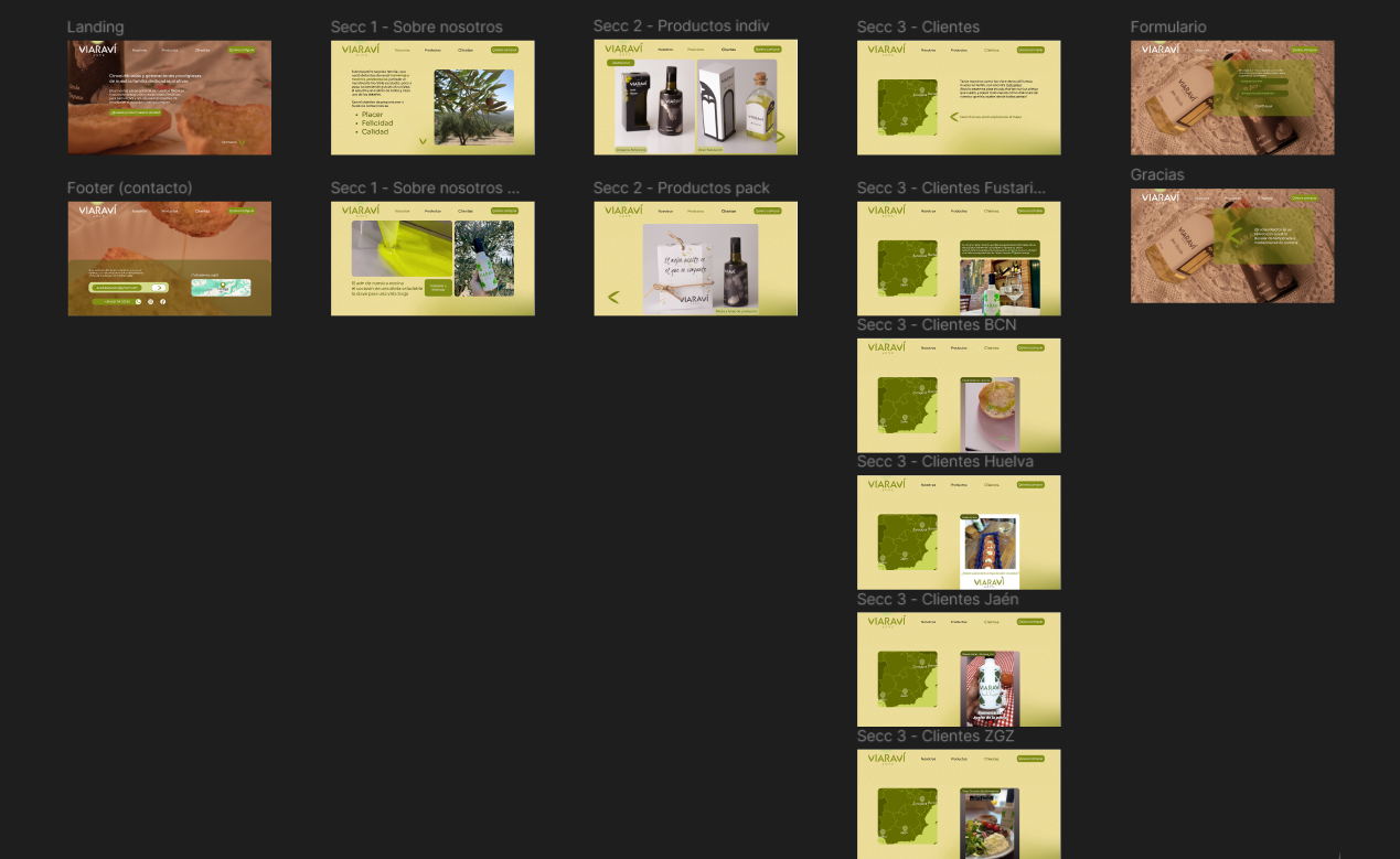
Landing
Finally, a landing page is created to give the finishing touch to this brand. After an investigation on other landings that shared brand values with Viaraví, it was decided to make the web have the following sections:
- Header with call to action
- About the brand
- Products
- Clients
- Footer
Each of them sketched in a wireframe


Project showcase